Monday 25 April 2011

Landscapes

Landscape Photography is intended to depict the space and nature of the world and the environment in its vastness.

Our assignment brief was to find a painting that we admire and attempt to replicate the scene photographically. The artists whose work we chose to replicate are Georges Seurat, Claude Monet and De Cort, all of which have different painting styles but all have landscape paintings.

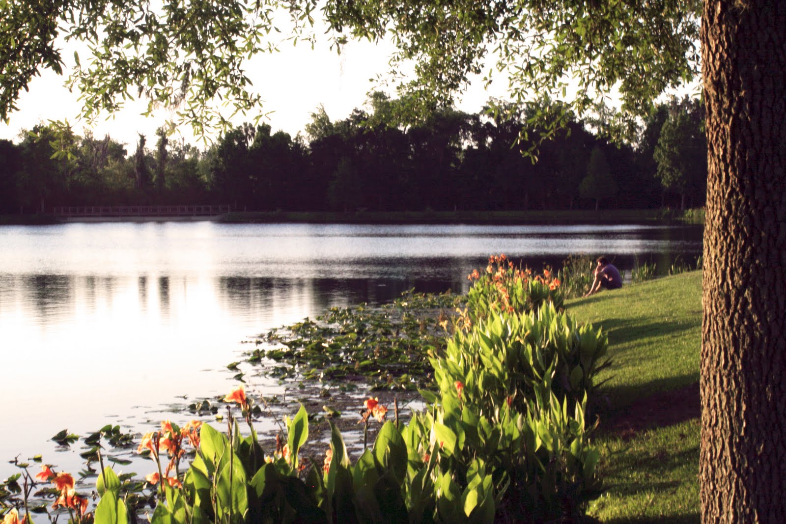
Georges Seurat's 'Femmes au bord de l'eau'
- Jenny -
f/29 1/25s
ISO 200
I have always remembered the series of Seurat paintings that depict people enjoying themselves on a river bank ever since I saw when visiting art galleries when I younger. So when I saw this landscape with someone relaxing by the lake I thought that it would be the perfect opportunity to recreate one of his paintings. I felt he whole scene captured the same feelings as one particular painting 'Femmes au bord de l'eau' and by flipping the original image horizontally i was even able to get the layout of the image to match up almost perfectly with the painting, with the tree, person and bank on the right, and lake on the left. Also coincidently the two people people sitting on the bank just happen to be wearing purple, visually highlighting the connection between the two images further.
see Georges Seurat's painting here...

Claude Monet's 'The Water Lily Pond'
- Jenny -
F/29 1/20s
ISO 200
Although Monet did a series of water lily paintings this was one of the ones that caught my eye due to the low down angle he seemed to paint the lilies from. I tried to recreate the same viewpoint when taking my photo so I held the camera close to the water when taking the shot. I also like how in his painting he has some dark vertical lines, lines which I have also created in my photo by capturing the clear reflections of some tree trunks. So it may not be Giverny, but I feel that Lake Dixie, Florida, has provided the perfect tranquil setting to capture the same calming feeling as Monet did with his painting. 
see Claude Monet's painting here...


De Cort's 'View of Charlton Park'
- Dan -
f/320   1/320s
ISO 200
This landscape photo is meant to replicate De Cort's "View of Charlton Park". I chose this to replicate this painting as the style is similar to John Constable whose paintings I like. I think I managed to capture an image of almost the identical composition, apart from the people. I feel the photo evokes a feeling of grandness and royalty.
see De Cort's painting here...

Surrealism

Surreal images are those that would not seem out of the ordinary in a dream, but in reality convey the feelings of uneasiness, strangeness and a sense of surprise. Most artists who paint surreal images are often inspired by dreams or when they are in the state between awake and asleep.

After looking at surreal paintings and photos it immediately became apparent we had to show something unusual, something you wouldn’t ordinarily see or imagine. Although for the assignment we primarily focused on trying to manipulate photos so that they could depict a person’s dreams in a very original and artistic way, we also found that some of our shots had that dreamlike feeling without the addition of secondary images.

- Dan -
f/10   1/100s
ISO 200
I took the original photo of this in a small shopping centre opposite St. Paul's cathedral. As soon as I walked in I realised the strangeness of the building with all its sharp edges and reflective windows. When looking up from the centre it feels as though the building is at a dizzying height which I wanted to exaggerate even further and thus making a surreal photo.
To do this I simply duplicated the image and rotated one to place on top of the other, although the process was simple I feel it accomplished what I intended better than I thought it would. Looking at the photo it gives the impression you are trapped by unending metal and glass with the only way out at the top, but way too high to reach. Something which could be seen more as a nightmare then a dream.

- Dan -
f/10   1/100s
ISO 200
After taking the above photo and starting to walk out the shopping centre I noticed how perfectly centred the cathedral was within the two windows and almost perfect reflections it cast. Even before editing the photo in Photoshop I thought the image was already surreal in the way the reflections were so perfectly made on the windows. However, the idea of the photo being surreal might not immediately be apparent so we then decided editing the Photo to exaggerate the surrealism would be a good idea.
The whole idea of this photo is taking a picture of a reflection, as if I was looking in a mirror with the cathedral and building behind me. After looking at the photo more, we also came up with the idea that it look as if I was looking down on a tiny city as some kind of giant.
- Jenny -
f/5 1/30s
ISO 200
Prior to taking this particular photo, which is actually of a big leaved plant, I took
a picture of the same plant but with the sun much more hidden behind it. When I
noticed some subtle sun rays coming through the gaps between the leaves I
wondered what would happen if I let more of the sun into the shot, and here is the
 interesting result. I thought it gave the sense of being in that state between awake
and dream quite well, perhaps with the image even representing that moment you
open your eyes after waking and the light and colour come flooding in.


- Jenny -
f/22 1/40s
ISO 100
Although I thought my first image had a strong surreal feeling about it we both
thought that our assignment brief was asking us to head in a photoshop
direction. So for this particular image I began with the photo of my pool on
holiday. I loved how the lighting of the picture came out quite intense, with the 
orange ring coming out practically neon and contrasting with the almost
silver water. Then it came to what to add to the picture and I thought that I
could do something with the ring as it is the focal point, and the most obvious
way to do that was have something come out of it. Then when my dad said a couple
of days later how you're only allowed to water the plants two days a week where
we were staying in Florida due to house association restrictions I thought
why not put a tree in the ring where it can get all the water it wants. Then my
mum joked that the ring stops the plant from drowning as plants shouldn't have
too much water. The picture is quite humorous but I think it can be considered
surreal due to the juxtaposition of objects you wouldn't usually expect to see
together, making you double-take when glancing at the image as it doesn't seem real.


DIY Bokeh


When researching Bokeh online we came across an article called 'DIY - Create Your Own Bokeh', which involved shaping the dots of light in the Bokeh area by cutting out a desired shape in the middle of a 'fake' lens hood. The lens hoods we used were simply created using black card and tape.

The trick is to get the cutout shape the perfect size... if it was too big we either found it had little effect or you got deformed half-circle-half-star shapes, and if it was too small you ended up with a dark border around the photos. However, even when we overcame the sizing problems we were left with the issue that not all of the shapes turned out perfectly; depending on the position of the lights you can easily end up with half formed shapes.

So even though we both came to the conclusion that it is extremely difficult to get a perfect photo we still ended up with some pretty interesting results:

DIY Bokeh Lens Hoods
- Jenny -
f/5.6 1/30s
ISO 800
Out of all the shapes I the firefly was definitely one of my favourites as they came out very defined. This photo was
taken in Downtown Disney, Florida, and I choose to go there as I knew it would be a great place to find interesting
artificial lights and I wasn't disappointed. The main walkway had lights strung across it between the buildings and
this is why you can see a series of linear lines of fireflies. I also like how you still get a slight background, such as the
subtle palm tree silhouettes, that adds interest to the photo without detracting from the lights.
- Jenny -
f/5.6 1/4s
ISO 400
The reason why I love this picture so much is because of it simplicity. I love how the stars almost appear 3D, and find it has a calming effect as they seem to be floating aimlessly right in front of you. This time I also managed to get more of a mix of colours. 
- Jenny -
f/5 1/160
ISO 100
This experiment didn't exactly go to plan but I still love the results. I was actually
using a lens hood with a butterfly shape cut out of it when I visited the butterfly
garden in Harry P Leu Gardens but I found that even though it was easier to achieve
very shallow depth of field in the daylight, it was much easier at Downtown Disney to
get the desired shaped lights due to them being artificial. Here, on the other hand, there
were no distinctly defined lights in the background as I was working with small bits
of light coming through the leaves of a tree. However, although I may not have
gotten my butterfly blurs I did end up with the sort of bubble wrap textured blur
in the bottom righthand corner of the picture which I think looks pretty cool. I was
also so happy with the vibrancy of the colours that I left them unedited. 

The Circular Blur


We started off by trying to achieve the naturally occurring circular blurs that we had seen in the branch picture. To get this we used the lowest aperture setting to get the required shallow depth of field and tried it out during both the day, using natural light, and at night, using artificial lights. We both found that when taking photos in darker lighting it was very hard to get the foreground completely in focus whilst still achieving the perfect blur.

But after a lot of trial and error here are some of our best shots:

- Dan -
f/5.6   1/20s
ISO 200


- Dan -
f/5.6   1/20s
ISO 200

- Dan -
f/5.6   1/20s
ISO 200

- Jenny -
f/5.6 1/250s
ISO 100
This was one of my earlier attempts at having such a shallow depth of field
that you end up with the circular blur in the background. I got the right
depth of field, even managing to capture the small flies hovering above the tulip,
but unfortunately I could not get the 'perfect' blur because of the very dark
background. You can see small circles dotted around, but if I were to try this
again I would wait for more light to reflect of of the leaves in the background
in order to produce more circles in the Bokeh area.
- Jenny -
f/5.6 1/250
ISO 100
These two images worked out very well in regards to Bokeh. I think it was a combination of the size of the tree, as the branches in focus are actually very distanced from the blurred branches in the background, and the clear blue sky contrasting with the white flowers. Overall I prefer the photo above as the front flowers are very in focus and large, making it more dramatic. The one below, on the other hand, still looks pretty but the smaller size of the in-focus flowers means that they can get lost amongst the circular blurs.
- Jenny -
f/5.6 1/250
ISO 100


Bokeh - The Aesthetic Quality of the Blur

Failed Bokeh Picture
- Dan -


We got interested in 'Bokeh' after a shot Dan took on our visit to London for the earlier part of this assignment in which we were experimenting with depth of field. After taking an extremely close up photo of a branch we noticed on the camera display a series of perfect circles in the background. We both thought this looked really cool and Dan remembered that there was actually a name for this blurring effect as he had seen a online tutorial about it. Unfortunately when the picture was viewed on a normal sized screen we noticed the branch itself was slightly out of focus and so annoyingly it couldn't be submitted.

So when it came to the second part of this first year photography assignment and we were instructed to choose a third category of our choice, we both decided to give Bokeh a go. 

And so the online tutorials and articles on DIY Bokeh began...